SuperBuilder Theme Architecture
How site content and visual themes stay separated — and how Next.js components plug into canonical sections so existing pages keep working when the design changes.
1. Overview
SuperBuilder treats a website as three layers. Users edit content once; themes only change how that content looks.
| Layer | What it is | Changes when… | Edited via |
|---|---|---|---|
| Page config | Ordered sections + props (default-config.json) |
Text, images, section order | Builder WYSIWYG or grid save API |
| Canonical components | Stable types: navbar, hero, services, … |
Platform adds a new section type | canonical-components.ts |
| Theme | Colors, fonts, React skins | User picks or uploads a design | Template picker / ZIP upload |
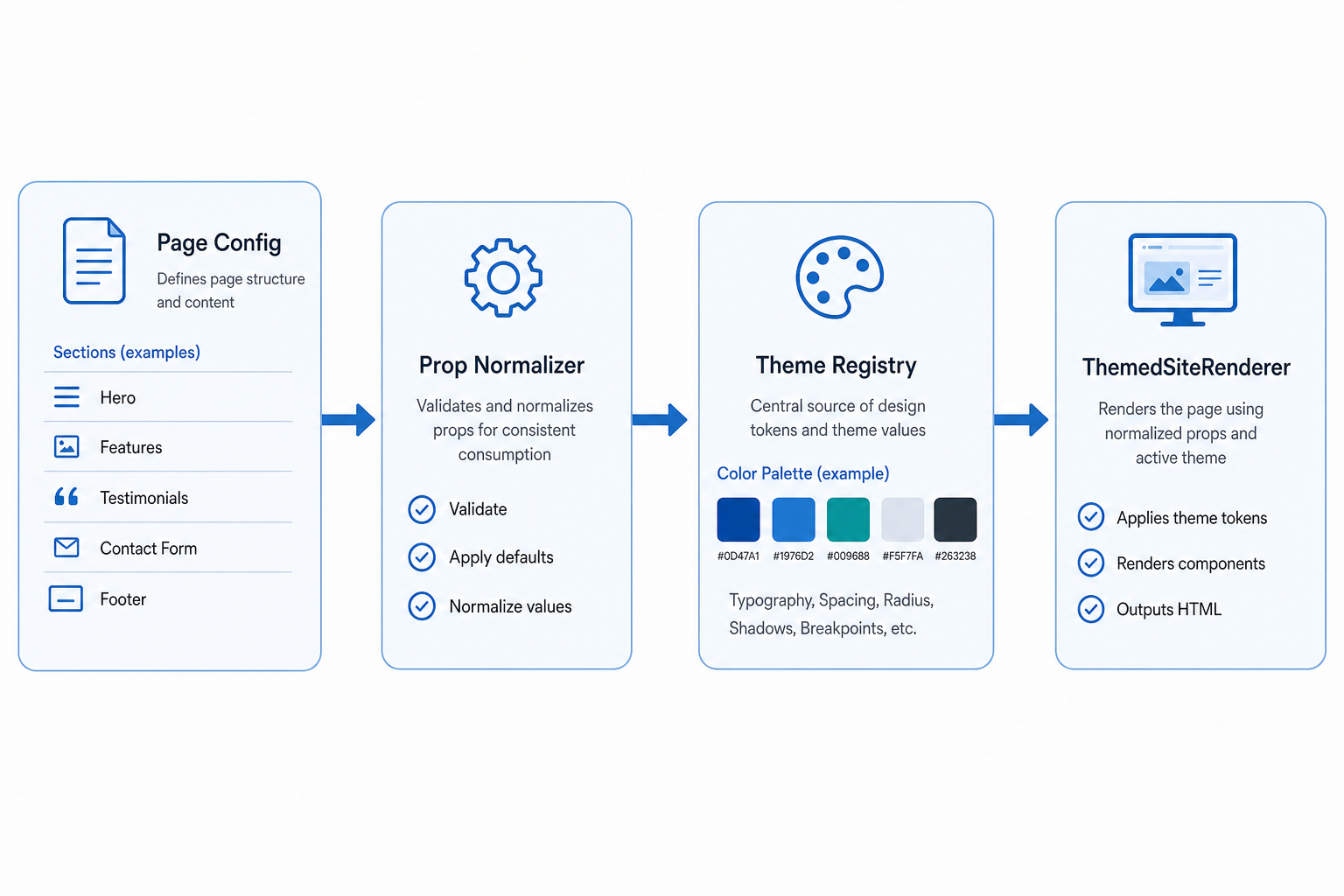
2. Mental model — same content, different skins
A restaurant site and an HVAC site can share the same section types. Only the theme components and design tokens change. Page structure stays in JSON.
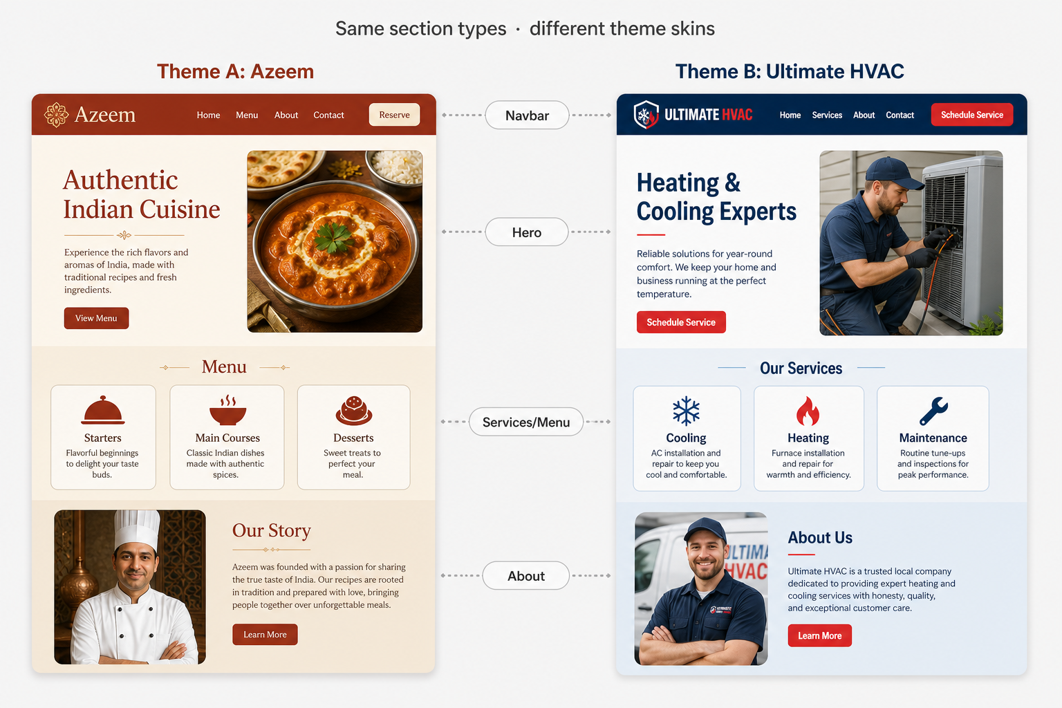
What stays the same
- Section IDs and order
- Canonical prop fields (brand, CTAs, phone)
- Widgets / SEO metadata
- Publish slug and site record
What the theme owns
- React component implementations
- CSS / SCSS / Tailwind styling
- Design tokens (
--theme-*) - Optional
adaptProps()mapping
3. User journey
- Browse —
/websitespick a bundled theme or upload a ZIP - Edit —
/builder/[slug]WYSIWYG + section tools (owner / edit collaborator only) - Save — grid config and/or content changes
- Publish — live site at published slug / subdomain
- View — anyone can open the published site (no builder chrome)
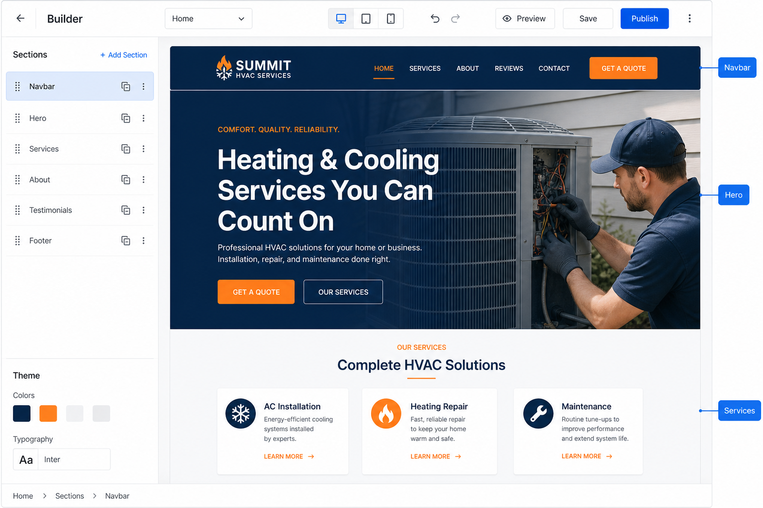
Site template IDs
| Source | Site templateId | Renderer |
|---|---|---|
| Bundled theme | azeem, hvac, ultimate-hvac, ultimate-hvac-v4, comfort-mechanical-v1, … | ThemedSiteRenderer |
| Next.js ZIP upload | nextjs-theme:{slug} | ThemedSiteRenderer + staged files |
| Single-page HTML | single-page:{slug} | SinglePageThemeRenderer (iframe) |
3b. Builder edit vs public view
Editing is private. Viewing a published site is public.
Gate: app/builder/[slug]/layout.tsx → requireSiteAccess(slug, 'edit').
| Surface | Who | Purpose |
|---|---|---|
/builder/[slug] |
Site owner (or collaborator with edit/full) |
Design / WYSIWYG / section config |
{subdomain}.magicsite.ai |
Anyone | Published live site (middleware → /published/…) |
/published/[slug] |
Anyone | Published preview on the main domain |
/builder/[slug] are redirected to the published URL when the site is
PUBLISHED. Drafts require sign-in as an editor.
3c. Ultimate HVAC v4
Current Next.js conversion of the Santa Cruz HVAC design.
Does not replace production ultimate-hvac.
Use templateId: ultimate-hvac-v4 for new sites.
| Theme id | Role | Notes |
|---|---|---|
ultimate-hvac |
Production | Montserrat / Open Sans; canonical layout |
ultimate-hvac-v4 |
Current conversion | Same default copy as production; live HTML hero + menuItems; header/hero fonts hard-coded Montserrat / Open Sans |
ultimate-hvac-v1 |
Removed | Composed-hero experiment — do not use |
| Path | Purpose |
|---|---|
app/magictemplates/ultimate-hvac-v4/ | Components + default-config.json |
public/images/ultimate-hvac-v4/ | Assets |
data/grid-configs/ultimate-hvac-v4-simple.json | Dev / seed page config |
adaptUltimateHvacV4Props | Adapter in lib/themes/service-theme-config.ts |
themes/ultimate-heating-cooling-nextjs/ | Source Next.js package |
#specials),
top bar (24/7 + Financing), hero trust badges, service blurbs, about + Seasonal Tune-Up Special,
named reviews, and service areas. CSS scope: .theme-ultimate-hvac-v4.
4. Key files
| Path | Role |
|---|---|
types/theme.types.ts | ThemeManifest, tokens, CanonicalComponentType |
lib/themes/canonical-components.ts | Shared prop interfaces |
lib/themes/prop-normalizer.ts | Legacy → canonical props |
lib/themes/theme-registry.ts | registerTheme(), bundled loaders |
lib/themes/service-theme-config.ts | Service industry theme list |
lib/themes/nextjs-theme-upload.ts | ZIP extract, validate, stage |
lib/themes/uploaded-theme-loader.ts | Runtime load for uploads |
lib/services/theme.service.ts | MongoDB site_themes |
app/components/theme/ThemedSiteRenderer.tsx | Renders config through a theme |
app/components/theme/ThemeProvider.tsx | Injects --theme-* CSS vars |
app/magictemplates/{slug}/ | Bundled theme packages |
app/magictemplates/_uploaded/ | Staged user ZIP components |
app/websites/components/UploadThemeModal.tsx | User upload UI |
app/admin/themes/page.tsx | Admin global themes |
5. Theme ownership
| Uploader | Where | Visibility | Who can use |
|---|---|---|---|
| Admin | /admin/themes |
global |
Everyone |
| User | /websites → Upload Theme |
private |
That account only |
| Bundled | theme-registry.ts / service themes |
always on | Everyone |
Private themes return 403 to other users on list/load APIs.
6. Canonical component types
Every theme should implement as many of these as possible. Aliases are auto-normalized.
| Type | Aliases | Typical industry use |
|---|---|---|
navbar | nav, navigation, header | All sites |
hero | — | All sites |
about | aboutus, about-us | All sites |
menu | menusection, menu_section | Restaurants |
services | — | HVAC, roofing, pest, electric |
gallery | — | Restaurants / portfolios |
testimonials | reviews | Service businesses |
contact | — | All sites |
footer | — | All sites |
Navbar.tsx, Hero.tsx, Services.tsx, About.tsx,
Menu.tsx, Gallery.tsx, Testimonials.tsx,
Contact.tsx, Footer.tsx (case-insensitive).
7. Component gallery (visual contracts)
These mockups show the role each canonical section plays. Your React implementation can look completely different — as long as it consumes the props below.
navbarheroHeating & Cooling Experts
Reliable comfort. Honest service. Year-round.
servicesaboutSanta Cruz Comfort Experts
Locally focused, honest heating & cooling for homes and businesses.
testimonialscontactSanta Cruz County
Mon–Sun · 24/7 emergency
menu · restaurantsgalleryfooter8. Prop contracts (canonical shapes)
Defined in lib/themes/canonical-components.ts.
Themes may use different prop names internally if they provide adaptProps.
Responsive layout required contract
Every theme must work on mobile and desktop. Upload validation
(lib/themes/theme-contract-validator.ts) rejects packages that lack viewport breakpoints
when they use fixed multi-column grids.
- Include
@media (max-width: …)/@media (min-width: …)in CSS, or Tailwindsm:/md:/lg:classes, orrepeat(auto-fit/auto-fill, …) - Collapse multi-column grids to
1frunder ~640–768px - Navbar should expose a mobile menu (
menuToggle/ hamburger /aria-expanded) prefers-reduced-motionalone does not count as responsive
/* Example */
.serviceGrid { display: grid; grid-template-columns: repeat(3, 1fr); }
@media (max-width: 768px) {
  .serviceGrid { grid-template-columns: 1fr; }
  .primaryNav { display: none; }
  .primaryNav.open { display: flex; flex-direction: column; }
}
Site business fields data-field contract
Company identity is shared across the site via pageConfig.siteBusiness
(lib/themes/business-fields.ts). The builder AI uses
update_site_business_info to write once and fan out into navbar / hero / about / contact / footer
(including tel: links). At render time, ThemedSiteRenderer overlays these fields onto every section.
Themes must mark live company details in the DOM:
<strong data-field="phone">{phone}</strong>
<a href={phoneHref} data-field="phoneHref">…</a>
<span data-field="address">{address}</span>
<span data-field="brandName">{brandName}</span>
<span data-field="companyName">{companyName}</span>
<span data-field="email">{email}</span>
<span data-field="hours">{hours}</span>
<span data-field="locationLabel">{locationLabel}</span>
siteBusiness?: {
brandName?: string;
companyName?: string;
phone?: string;
phoneHref?: string; // auto-derived from phone when omitted
email?: string;
address?: string;
hours?: string;
locationLabel?: string;
}data-field so a single AI update refreshes the whole site.
NavbarProps required contract
Navigation must be live menuItems props — never baked into hero artwork images.
Legacy aliases links, navLinks, and string items are normalized to menuItems.
Utility-bar copy may use topItems or the alias announcements.
interface NavbarProps {
  logo?: string;
  brandName?: string;
  /** Required for a usable header */
  menuItems: Array<{ label: string; href: string; target?: string }>;
  /** Optional announcement / utility bar lines */
  topItems?: string[];
  /** Alias for topItems */
  announcements?: string[];
  ctaText?: string;
  ctaHref?: string;
  phone?: string;
}{ "component": "navbar", "props": { "brandName": "Acme", "menuItems": [{ "label": "Home", "href": "#top" }], "phone": "(555) 123-4567" } }
menuItems: [] hides all nav links — treat empty arrays as missing and fall back to defaults.
Hero title: "" clears the H1 (?? does not help) — use trim() || default.
Seeding a site from empty manifest shells (props: {}) shows brand/image fallbacks with
blank hero copy — always ship populated default-config.json with
component, visible: true, and real props.
CSS must target .theme-{manifest.id} (or :is(.theme-slug, .theme-package-id));
a package scoped only to a different class renders unstyled in SuperBuilder.
See §3c Ultimate HVAC v4 for the full bundled HVAC map
(ultimate-hvac production vs ultimate-hvac-v4 conversion).
HeroProps
interface HeroProps {
  title: string;
  subtitle?: string;
  description?: string;
  badge?: string;
  highlightedText?: string;
  primaryButton?: { text: string; href: string; target?: string };
  secondaryButton?: { text: string; href: string; target?: string };
  backgroundImage?: string;
  image?: string;
  stats?: Array<{ value: string; label: string }>;
}
ServicesProps
interface ServicesProps {
  title?: string;
  subtitle?: string;
  services: Array<{
    title: string;
    description?: string;
    icon?: string;
    image?: string;
  }>;
}
TestimonialsProps
interface TestimonialsProps {
  title?: string;
  subtitle?: string;
  testimonials: Array<{
    quote: string;
    author: string;
    role?: string;
    avatar?: string;
  }>;
}
ContactProps / FooterProps (abbreviated)
interface ContactProps {
  title?: string; subtitle?: string;
  email?: string; phone?: string; address?: string; hours?: string;
}

interface FooterProps {
  brandName?: string; address?: string; phone?: string; email?: string;
  copyright?: string;
  socialLinks?: Array<{ platform: string; url: string; icon?: string }>;
}AboutProps, MenuProps, and GalleryProps
in canonical-components.ts.
9. Page config example (Ultimate HVAC)
Real shape from data/grid-configs/ultimate-hvac-simple.json.
Required SuperBuilder fields per section: component, visible: true, and
populated props. type is an accepted alias for component, but
do not ship type alone.
{
  "slug": "ultimate-hvac",
  "sections": [
    {
      "id": "section-navbar",
      "component": "navbar",
      "props": {
        "brandName": "ULTIMATE",
        "tagline": "HVAC",
        "phone": "(831) 226-1937",
        "ctaLabel": "Call Now",
        "links": [
          { "label": "Home", "href": "#top" },
          { "label": "Services", "href": "#services" },
          { "label": "Contact", "href": "#contact" }
        ]
      }
    },
    {
      "id": "section-hero",
      "component": "hero",
      "props": {
        "headline": "Heating & Cooling Experts",
        "subheadline": "Reliable comfort. Honest service. Year-round.",
        "eyebrow": "Santa Cruz's Trusted",
        "primaryCtaLabel": "Schedule Service",
        "primaryCtaHref": "#service-form",
        "badges": ["Licensed & Insured", "24/7 Emergency Service"]
      }
    },
    {
      "id": "section-services",
      "component": "services",
      "props": {
        "title": "Complete HVAC Solutions",
        "items": [
          {
            "name": "AC Services",
            "description": "Installation, repair and maintenance.",
            "image": "https://images.unsplash.com/..."
          }
        ]
      }
    }
  ]
}headline, links, items).
That is fine for bundled themes that own both config and components.
For maximum swapability, prefer canonical names (title, menuItems, services)
or map via adaptProps.
10. Theme folder layout
Example component (Hero)
From app/magictemplates/ultimate-hvac/components/Hero.tsx:
export default function Hero({
  headline = 'Heating & Cooling Experts',
  subheadline = 'Reliable comfort. Honest service. Year-round.',
  description = 'Professional HVAC service…',
  primaryCtaLabel = 'Schedule Service',
  primaryCtaHref = '#contact',
  eyebrow = "Santa Cruz's Trusted",
  phone = '(831) 226-1937',
  badges = ['Licensed & Insured', 'Honest Pricing'],
}: HeroProps) {
  return (
    <section className="uh-hero">
      <p className="uh-eyebrow">{eyebrow}</p>
      <h1>{headline}</h1>
      <h2>{subheadline}</h2>
      <p>{description}</p>
      {/* CTAs + trust badges */}
    </section>
  );
}
Upload ZIP layout (auto-detected)
11. How rendering works
- Builder / published page calls
DynamicTemplateRendererwith slug + page config. - If a theme is registered for that slug,
ThemedSiteRendereris used (preferred path). - Each section’s type is resolved (aliases → canonical).
normalizeSectionProps()maps legacy shapes to canonical props.- Optional theme
adaptProps(type, props)remaps to component-specific props. ThemeProviderscopes design tokens as CSS variables on.theme-{slug}.- Each section renders the theme’s React component for that slot.
import { ThemedSiteRenderer } from '@/app/components/theme/ThemedSiteRenderer';

<ThemedSiteRenderer
  config={pageConfig}
  themeId="ultimate-hvac"
  editable
/>12. Prop normalizer examples
lib/themes/prop-normalizer.ts accepts legacy shapes so old configs keep working.
Navbar — string items → menuItems
Legacy input
{
  "component": "nav",
  "props": {
    "navbar": {
      "restaurantName": "Azeem Restaurant",
      "items": ["Home", "Menu", "About"],
      "action": "Book Table"
    }
  }
}
Canonical output
{
  "brandName": "Azeem",
  "menuItems": [
    { "label": "Home", "href": "#home" },
    { "label": "Menu", "href": "#menu" },
    { "label": "About", "href": "#about" }
  ],
  "ctaText": "Book Table",
  "ctaHref": "#contact"
}
Common renames
| Legacy | Canonical |
|---|---|
restaurantName / companyName | brandName |
items (string[]) | menuItems |
action | ctaText |
aboutText / text | about body fields |
reviews section type | testimonials |
13. adaptProps — theme-specific mapping
Use when your components expect different names than the canonical contract
(e.g. Ultimate HVAC headline vs canonical title).
adaptProps: (type, props) => {
  if (type === 'hero') {
    return {
      headline: props.title,
      subheadline: props.subtitle,
      description: props.description,
      primaryCtaLabel: props.primaryButton?.text,
      primaryCtaHref: props.primaryButton?.href,
      eyebrow: props.badge,
    };
  }
  if (type === 'navbar') {
    return {
      brandName: props.brandName,
      links: props.menuItems,
      ctaLabel: props.ctaText,
      ctaHref: props.ctaHref,
    };
  }
  if (type === 'services') {
    return {
      title: props.title,
      items: (props.services || []).map((s) => ({
        name: s.title,
        description: s.description,
        image: s.image,
        icon: s.icon,
      })),
    };
  }
  return props;
}
14. CSS design tokens
ThemeProvider exposes these on .theme-{slug}:
| CSS variable | Manifest source |
|---|---|
--theme-primary | tokens.colors.primary |
--theme-secondary | tokens.colors.secondary |
--theme-accent | tokens.colors.accent |
--theme-background | tokens.colors.background |
--theme-text | tokens.colors.text |
--theme-font-heading | tokens.fonts.heading |
--theme-font-body | tokens.fonts.body |
Ultimate HVAC token swatches
/* Prefer scoped styles so builder chrome is not affected */
.theme-ultimate-hvac {
  --theme-primary: #072d5f;
  --theme-accent: #d92b28;
  font-family: var(--theme-font-body);
}

.theme-ultimate-hvac .uh-btn-red {
  background: var(--theme-accent);
}.theme-{slug} (see TemplateIsolationWrapper)
so styles do not leak into the editor chrome.
15. Adding a bundled theme
- Create
app/magictemplates/{slug}/with components + CSS - Add
theme.manifest.jsonand default page config - Register via
registerTheme()orSERVICE_THEME_SLUGS - Register capabilities in
lib/templates/template-registry.ts - Add
data/grid-configs/{slug}-simple.json - Smoke-test at
/builder/{slug}
Registration snippet
registerTheme('ultimate-hvac', async () => {
  const [Navbar, Hero, Services, About, Testimonials, Contact, Footer] =
    await Promise.all([
      import('@/app/magictemplates/ultimate-hvac/components/Navbar').then(m => m.default),
      import('@/app/magictemplates/ultimate-hvac/components/Hero').then(m => m.default),
      import('@/app/magictemplates/ultimate-hvac/components/Services').then(m => m.default),
      import('@/app/magictemplates/ultimate-hvac/components/About').then(m => m.default),
      import('@/app/magictemplates/ultimate-hvac/components/Testimonials').then(m => m.default),
      import('@/app/magictemplates/ultimate-hvac/components/Contact').then(m => m.default),
      import('@/app/magictemplates/ultimate-hvac/components/Footer').then(m => m.default),
    ]);

  await import('@/app/magictemplates/ultimate-hvac/app/globals.css');

  return {
    manifest: { /* from theme.manifest.json */ },
    components: {
      navbar: Navbar,
      hero: Hero,
      services: Services,
      about: About,
      testimonials: Testimonials,
      contact: Contact,
      footer: Footer,
    },
  };
});
16. Uploading themes
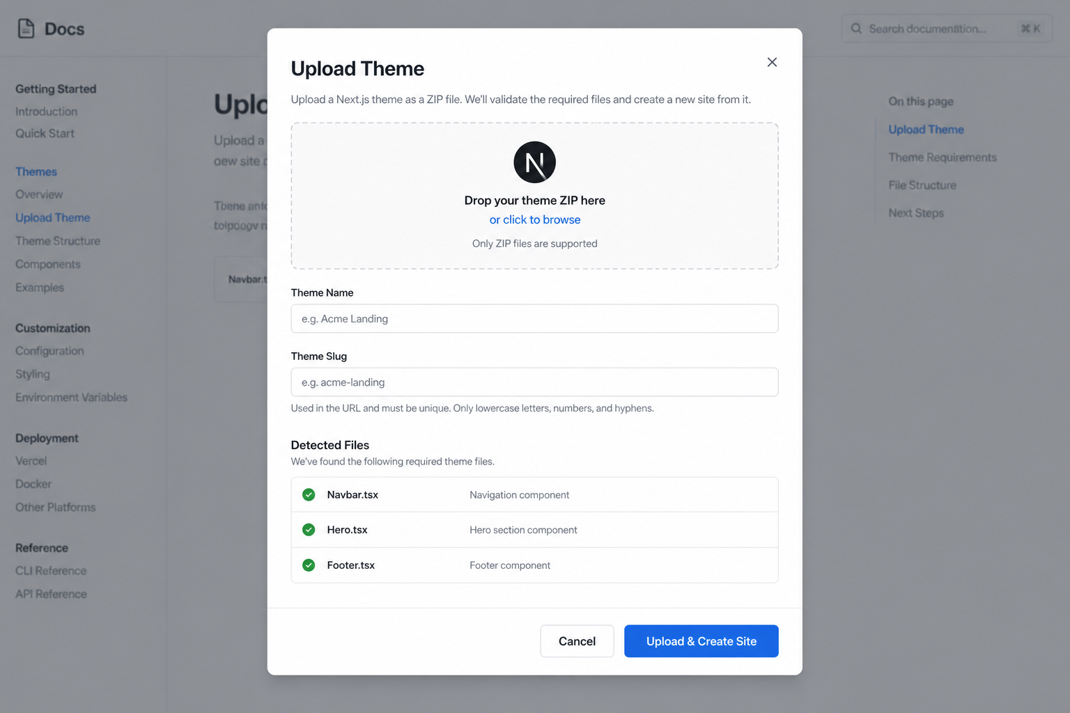
Users — Next.js ZIP (recommended)
- Go to My Websites (
/websites) → Upload Theme - ZIP the Next.js project (exclude
node_modulesand.next) - Name the theme; optionally create a website from it
Requirements
- Format:
.zipmax 50MB · single-page.htmlmax 5MB - Project:
package.jsonwithnextat root or one folder deep - Filenames:
Navbar.tsx,Hero.tsx,Footer.tsx, … - Locations:
components/,app/components/, orsrc/components/ - Tokens:
tailwind.configor:rootinapp/globals.css
What happens on upload
Before staging, the uploader validates TypeScript component sources against the
prop contracts in this guide
(lib/themes/theme-contract-validator.ts + canonical-components.ts).
Missing Navbar / Hero / Footer, missing
export default, or components that do not accept canonical props
(e.g. navbar without menuItems / links / navLinks)
cause a 422 rejection with actionable errors.
- ZIP extracted and validated as Next.js
- Components mapped to canonical slots
- Tokens extracted into a theme manifest
- Files staged under
app/magictemplates/_uploaded/{userId}/{slug}/ - Full source kept in
data/theme-projects/{userId}/{slug}/source/ - MongoDB record with
visibility: private - Optional site with
templateId: nextjs-theme:{slug}
Admins — global themes
Use /admin/themes with a server folder path (not a browser upload).
POST /api/admin/themes
{
  "projectPath": "html-templates/my-template",
  "themeSlug": "bistro-modern",
  "themeName": "Bistro Modern"
}
17. Theme manifest schema
{
  "id": "ultimate-hvac",
  "slug": "ultimate-hvac",
  "name": "Ultimate HVAC",
  "version": "1.1.0",
  "source": "nextjs",
  "tokens": {
    "colors": {
      "primary": "#072d5f",
      "secondary": "#65748a",
      "accent": "#d92b28",
      "background": "#ffffff",
      "text": "#10233f"
    },
    "fonts": {
      "heading": "'Montserrat', sans-serif",
      "body": "'Open Sans', sans-serif"
    }
  },
  "supportedComponents": [
    "navbar", "hero", "services", "about",
    "testimonials", "contact", "footer"
  ],
  "paths": {
    "components": "components",
    "globalStyles": "app/globals.css"
  }
}
Starter file: app/themes/_theme-starter-kit/theme.json
18. APIs quick reference
POST /api/themes/upload          # multipart ZIP/HTML (private)
GET  /api/themes                 # themes available to current user
GET  /api/themes/{slug}          # manifest (access-controlled)
GET  /api/themes/{slug}/html     # single-page HTML
POST /api/admin/themes           # admin global import via projectPath
GET  /api/admin/themes           # admin list + docsUrl

# Page content (builder)
GET  /api/editor/grid/load?slug=
POST /api/editor/grid/save       # { pageConfig }
GET  /api/editor/wysiwyg/load-changes?slug=&templateId=
POST /api/editor/wysiwyg/save-changes
POST /api/editor/publish
User upload fields
POST /api/themes/upload
Content-Type: multipart/form-data

file:        (ZIP or HTML)
themeName:   Bistro Modern
themeSlug:   bistro-modern
createSite:  true
siteName:    My Restaurant
siteSlug:    my-restaurant
19. Theme author checklist
- Components named to match canonical slots
- At least
navbar,hero,footerimplemented - Props documented or mapped with
adaptProps - Design tokens in manifest + CSS variables
- Global CSS scoped under
.theme-{slug} default-config.json/ grid config with real default content- Registered in theme registry (+ template capabilities if bundled)
- Tested in
/builder/{slug}: edit text, reorder, save, publish - ZIP excludes
node_modules/.next(uploads) - Mobile layout verified
20. Common mistakes
| Mistake | Fix |
|---|---|
| Hardcoding all copy inside React | Read from props; put defaults in page config |
Odd filenames (HeaderBar.tsx) |
Rename to Navbar.tsx or map in importer |
| Unscoped global CSS breaks builder | Scope under .theme-{slug} |
ZIP includes node_modules |
Exclude it — upload will be huge / fail |
| Expecting theme swap with theme-only prop names | Use canonical props or adaptProps |
| Components don’t appear after upload in dev | Hard refresh — Next must pick up staged files |
menuItems: [] (empty array) |
Header shows logo + CTA but no nav links. Treat empty arrays as missing; fall back to defaults. |
Hero title: "" (empty string) |
H1 disappears because ?? does not treat "" as missing. Use trim() || default. |
CSS scoped to wrong class (e.g. .theme-foo vs id foo-v3) |
Scope under .theme-{manifest.id} — e.g. .theme-ultimate-hvac-v4 |
| Nav baked into hero artwork PNG | Always render live HTML menuItems in Navbar |
| Wrong / missing heading font | Load Montserrat + Open Sans (same Google Fonts import as ultimate-hvac). Prefer hard-coded font-family: Montserrat, sans-serif on header/hero so ThemeProvider tokens cannot override. |
Changelog
v1.4
- Bundled theme id
ultimate-hvac-v4(renamed from v3) — production default content + Montserrat/Open Sans on header/hero - Removed unused
ultimate-hvac-v1 - Builder edit gate:
/builder/[slug]requires owner or edit collaborator - Documented empty-value pitfalls and navbar
menuItemscontract
v1.3
- Public HTML guide, navbar contract, prop-normalizer aliases
21. Roadmap
- Theme picker UI in builder (swap skin without changing content)
ZIP upload endpoint✓Auto-wire Next.js components into runtime loader✓Database storage for user-uploaded themes✓Admin vs user ownership✓User upload UI on /websites✓Builder edit access gate✓- Remove legacy
*Template.tsxwrappers